Technologies Used: HTML5, CSS, SVG, JavaScript, D3.JS, and Dimple.
Project at CERN as an Openlab Summer Student from June to August 2016
With over 7300 hypervisors in two data centers in the CERN Openstack cloud there is a need to easily visualize the current usage and allocations. My project was to investigate and prototype a service dashboard after collecting the topology information of the CERN cloud. Standard monitoring building blocks which assist in resource planning and visualization of Openstack cloud resources by the cloud administration team and WLCG resource management, were used for this purpose.
"A prototype that visualizes the cloud resources at CERN"
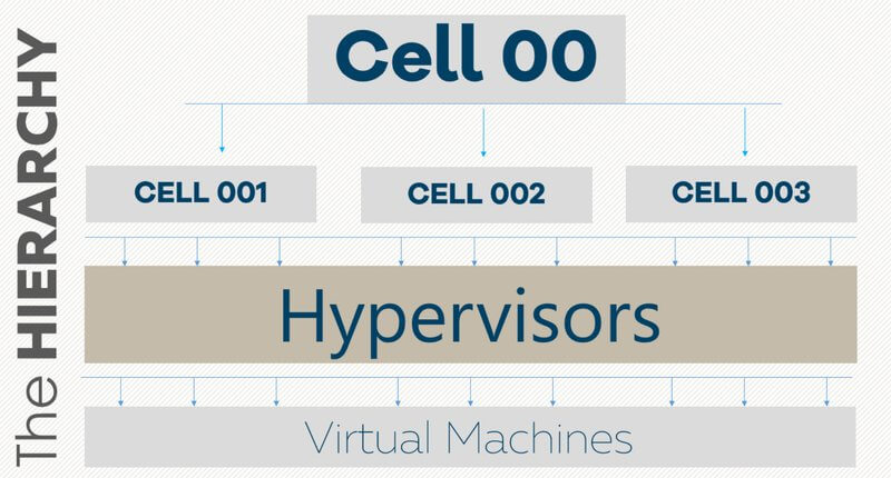
The topology of cloud resources at CERN follows hierarchical format. At the highest level there is a central cell, which will be referred to as cell00 in the rest of the report. At the next level there are several child cells which have been categorized on the basis of their computing speed, performance, and storage capacities. Each of these sub cells have hypervisors running on them, and every hypervisor in turn hosts one or several virtual machines.
Purpose All of the data on the topology of the cloud and the details on all the cloud resources are not available in a single place, being spread in different databases. A topology collector was written which dumps it into a single json file. It is very inefficient, if not impossible to dig through an enormous file every time some information is required. Also, a json file is not the best or the most comprehensible representation of data for humans. Therefore, a dashboard that represents the relationship between several cloud components in an easy to understand format was required.
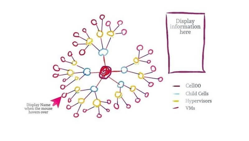
Process The proposed solution was to design a dashboard that translates the hierarchy in the data stored in the json file (topo.json) into a graph in which each node would represent a cloud component and every edge would show the relationship that the components share with each other.
In order to create an effective representation of data it is significant to draw a distinction between the exploratory and explanatory data visualization. While working on the exploratory side of visualization it was important to get a sense of what the data is and what it can convey to its audience (the number, type, status, etc of various cloud components and the relationship they share with each other). This was a process of turning over different rocks to try to find one or two interesting nuggets that the audience would be interested in. Studying these helped me design an initial, rough idea of what the central graph in the dashboard must look like, represent, and highlight.
In the next phase, the explanatory space of data visualization had to be explored. Attention was paid to allow users to explore the data in interesting ways and look at it from different angles, in an unbiased way. In order to do that four key points were considered:
- Having a really robust understanding of the context - The primary audience was identified as the members of the IT team and/or CERN employees or visitors who have prior understanding of cloud technologies and are trying to understand or find out details about the topology of cloud at CERN
- Choosing an appropriate type of visual - A collapsible force-layout graph was chosen as the best option for the representation of the data in topo.json. Allowing the users to zoom into faulty virtual machines was also considered. Simple features like clicking on the nodes to display their details and hovering over them to see their name were decided to be added to the dashboard
- Removing the clutter - It is a primary design principle to eliminate things that don't add informative value to the visuals. Doing so decreases cognitive load, does not overwhelm the user, and also causes the data to just stand out more
- Drawing the audience's attention to where we want them to pay it - It was at this point that the strategic decisions about the color, size, and placement of various elements on the page were made. Also, efforts were made to follow principles that make the design comprehensible to a wider audience, for example, mixing and using too much of red and green was avoided to make the visuals easy to read for color-blind people
Features Added
- The collapsible force layout graph was designed by customizing the open-sourced code available at Mike Bostock's (creator of D3.JS) website. Every child node of a particular parent node collapses and merges into its parent when the latter is clicked
- The users can hover over the nodes to read their name that is displayed in a tool tip, or they can click on them to read their details displayed in the table on the top-right of the dashboard
- On clicking the 'Zoom into faulty VMs' buttons on the top, a transition that loops endlessly begins focusing on the faulty VMs by zooming into them.
The feature of zooming into faulty virtual machines was also added
Resources
Award 2nd prize for best project presentation at CERN Lightning Talks Session 2016